Radial Bar Chart - Tableau Prep Template
- jaredflores0523
- Jul 5, 2022
- 3 min read
Updated: Jul 11, 2023

All credit for the original template, workbook and method goes to Toan Hoang. Thanks for letting me create this!
Original Post: Radial Bar Chart Tutorial - Toan Hoang
Prep Template Build Video: Radial Bar Chart Prep Template: Put Some Prep In Your Step - YouTube
Radial charts often add a factor of "wow, Tableau can do that?" to a viz. Are they best practice? Definitely not. The lengths of the bars are over or underemphasized based on their position so they are not being compared on the same scale. Are they fun to make though? Absolutely! I find charts like this to be really effective in understanding more about Tableau and how it works. How you can make it do what you want it to do. While I wouldn't recommend this chart in a business setting, there's still value in learning how to make it to expand your Tableau knowledge.
If you've been following this series, you know the purpose for these Tableau Prep templates. If you are new, then this is the high-level summary:
There are plenty of workbook templates with pre-built calculations for visualizations that aren't out-of-the-box in Tableau. Most of those templates require the data to be structured or pre-aggregated a very specific way. This template, as well as the other Prep templates, are to help you take your real-world data, plug it in, and get it in the correct structure to easily plug in to some workbook templates.
Toan Hoang helped me exponentially increase my understanding of Tableau when I fully understood that everything is just marks on an X and Y axis. Once you understand that, you can really map out what you want to visualize.
The radial bar chart that Toan designed plots points 3/4ths of the way around a circle. A circle is 360 degrees, so the highest value in your data set would go to 270. Every other categorical value is on a scale between 1 and 270 in comparison to that high value.
This template requires some minor work on your end as far as choosing and renaming columns, but most of the heavy lifting is already built out.
You can find the Prep flow, Template workbook, and the Sample - Superstore data set (if needed for demo purposes) here: Radial Bar Chart - Google Drive
The Data
In the original post, the data is structured like this:

The name is what we want each bar to represent, the path is the number of points, and the value is a percent of total. All you have to do on your end is pick the dimension you want as the name and the value that's being charted around the circle.
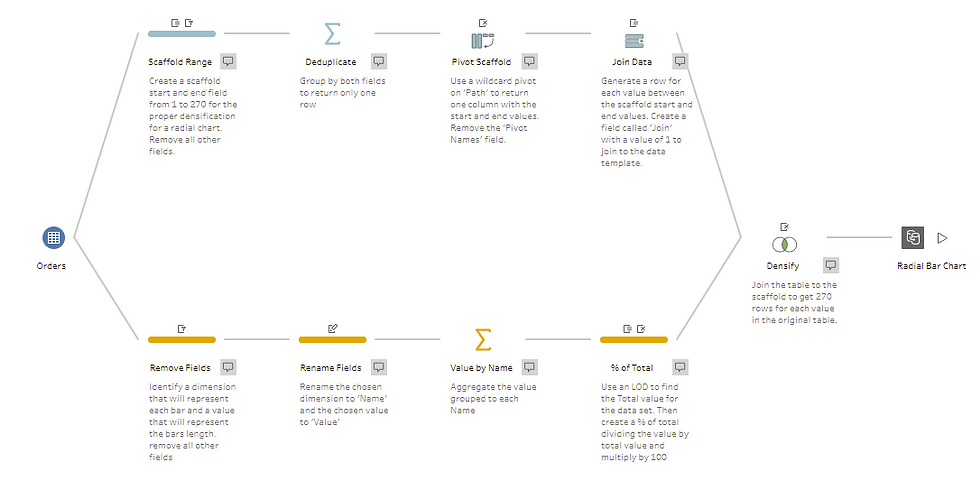
Prep Flow

This is what the pre-built portion of the Prep flow looks like.
First you will connect to your data source and drag your table to each of Scaffold Range and Remove Fields steps.


You will use the remove fields step to identify one dimension and one measure to keep. Since I'm using the Superstore dataset, I'm choosing the Sub-Category dimension and the Sales measure.

In the rename fields step, I rename Sub-Category to 'Name' and Sales to 'Value'

In the Value by Name step, the Name column goes to grouped fields and the Value column goes to Aggregated fields.

That's it! Now you open up the workbook in the google drive and connect to your new data. Connecting to the Data
Open the workbook provided in the google drive and go to the Radial Bar Chart sheet. Add a new data source.

Replace the original data source with your output:


All of the calculations will transfer over, and you've got a Radial Bar Chart!


I hope you are able to make use of this Prep template! If you'd like to learn how it was built, check out the video here: Radial Bar Chart Prep Template: Put Some Prep In Your Step - YouTube


Comments