Tableau Tuesday - Dynamic Measures and Dimensions with the Power of Parameters
- Jared Flores

- Dec 29, 2020
- 4 min read
Welcome to Tableau Tuesday! This is the first in what I'm hoping is a line of many instructional posts on Tableau techniques. Parameters are one of Tableau's most powerful features, and once you understand how to unlock their potential, you'll be ready to wow your stakeholders with flexible dashboards and self-service analytics.
When creating a dashboard to measure important KPIs, especially for a C-level audience, you typically want the end user to be able to get to the insights as quickly as possible. Sparklines are a useful way to get a very quick glance at how certain categories are trending and any outliers that need to be investigated further. Here’s an example with the Sample – Superstore data set

Details are kept to a minimum as this is meant for a high level view, but even this view can be made more informative through the use of one of Tableau’s most powerful functions: Parameters.
Parameters are user-generated fields that are unattached to the data set. By themselves they are quite useless, but by using them in a calculated field, you're providing Tableau with a set of instructions on how to utilize them. The eLearning courses on Tableau provide a simple 3-step rule to making the most of parameters:
Make it
Use it
Show it
I'm going to be using the Sample - Superstore data set so that you can follow along.
Make it
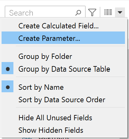
First, let's make a parameter to give our user control over the dimension (qualitative) in the view. Click the drop down arrow in the data pane and select "Create a Parameter". I'll call mine "Dimension Parameter"
Because this parameter is for the dimension, make the data type "String", select "List" for allowable values, and enter "Segment", "Category", and "Region". Once your parameter looks like the photo above, select OK.
Use it
Next, create a calculated field that tells Tableau what to do with the parameter values. I'm going to call this calculation "Dimension"

With this calculation, we're telling Tableau when the value of the parameter is "Segment", then display the Segment dimension within our data. Same for Category and Region. Click OK and let's use this in a view by dragging the Dimension field to the Rows shelf. We'll also drag Sales to the rows shelf, and Order Date to the Columns shelf as Continuous Months.
Then the final step to use our parameter: Show it. Right click on the Dimension Parameter in the Data Pane and click "Show Parameter"

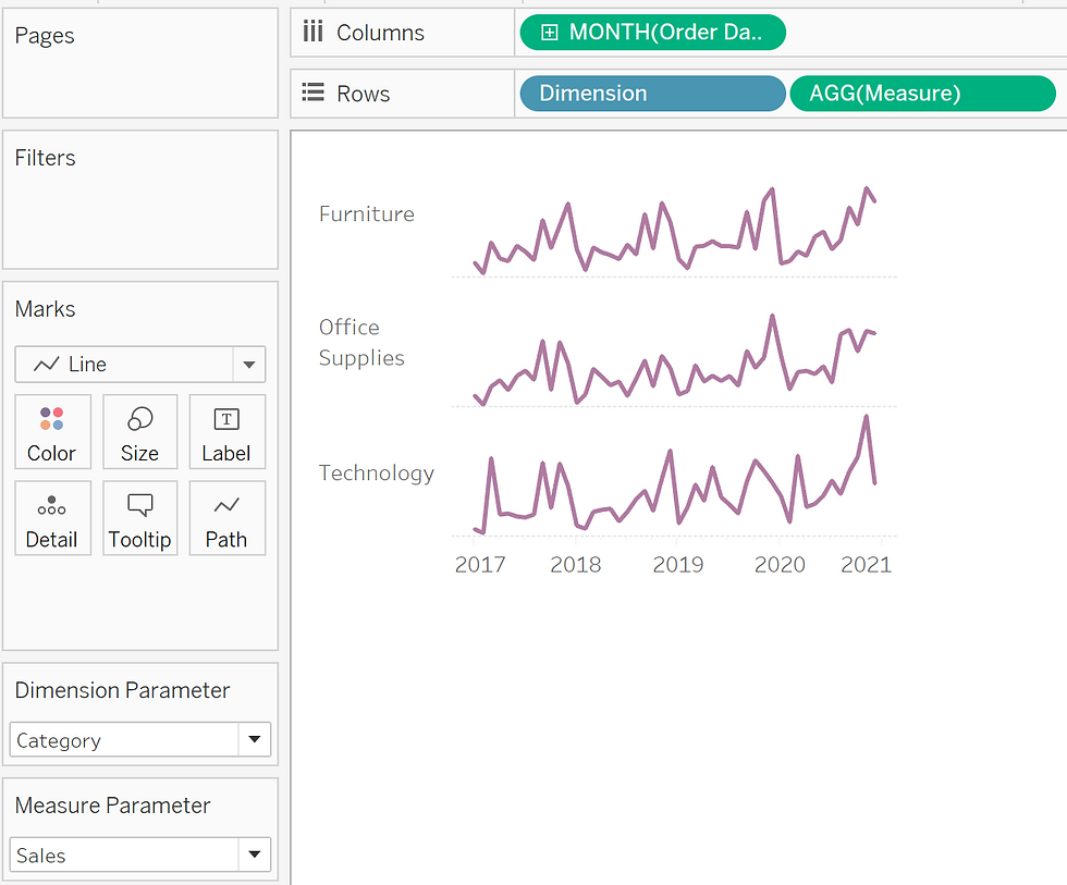
Make sure the Mark type is set to Line, and our view should look like this

We can change this view to answer different questions. The first visual in this post answers the question “How are sales trending by region?”
With our dimension parameter, we can tell Tableau how we want to view the data now. What if our question is “What are sales by category?”. We can change the dimension parameter from Region to Category

Now our view shows us a different breakdown of the data without having to dedicate additional space on a dashboard to a different graph and without having to go to a different source to answer this question.
Let's take this a step further and give our user control over the measure (quantitative) as well.
We'll repeat our Make it, Use it, and Show it steps again.
Make it
Create a parameter for the measure with List values of "Sales", "Profit", "Quantity", and "Discount"

Use it
Create a calculated field telling Tableau what to do with the parameter values.

A little different this time but the same concept. We specify the aggregation here because we want to see the Sum of Sales, but the Average Discount.
Now we replace the Sales pill within our view with the Measure calculated field. Right click and show the parameter, and our view looks like this now

Earlier, we changed our dimension from Region to Category. Now, what if as we look at the new breakdown, our question becomes “How is profit trending per category?”
For this we change the measure parameter from Sales to Profit

Now we can see the same categories by profit, in the same view.
This can lead to new insights much quicker. For example, toggling between the two measures we can see that the huge spike in Furniture sales in 2018 didn’t translate to similar profit growth, but the large dip in sales had a much larger impact on profit in the negative direction. There's many different ways to utilize this technique, giving the end user more control over dashboards and also helping them understand the true capabilities of Tableau. Design Tip
Sparklines usually accompany other visuals to provide a high level view of organizational health, and although they're light in detail, here's one way to make them pop a little more by making the lines filled. hold ctrl and click and drag the "Measure" field to create a duplicate on the rows shelf. This will create a separate Marks card for the duplicate field that can be changed into a different Mark. Right click on the duplicate Measure field and select Dual Axis. Then, right click on the secondary axis on the right of the visual and select Synchronize Axis. Let's change the second Marks card to an Area graph, and reduce the Opacity of the Color to 10%, and hide the headers.
Here's the final viz in action. Change the Parameters to watch how it changes!
I've started using dynamic fields whenever possible in my dashboards, but it's important to keep in mind your goal. Do you want to tell a specific story? Or do you want to create self-service analytics tool for different stakeholders who may have different questions about the same set of data? If your goal is to tell a specific story, the dynamic fields may not necessarily have a good place within the dashboard. A more static approach highlighting and annotating specific insights within the data would work better if this is the case.
What should be the topic for the next Tableau Tuesday? Feel free to contact me with suggestions!


Comments